
UI/UX designer and researcher, usability test conductor, wireframing, prortotyping
Partnered with the University of Toronto (UofT) - Center for International Experience Office (CIE)
Figma, Mural, Google suite
2023, Jan.-Apr.
The University Health Insurance Plan (UHIP) is the primary health insurance plan for international students studying and working in Ontario, Canada. The University of Toronto UHIP office manages UHIP services for approximately 25,000 international students.
Though there is a U of T UHIP website that aims to provide guidance for using UHIP services, users struggle to locate the information they need on the website. Consequently, the UHIP office receives over 12,000 emails annually from students with common inquiries, which is a time-consuming and ineffective process to manage. Students also experience long wait times and difficulties in reaching the U of T UHIP office team when they need help.
The UofT UHIP Office aims to enhance online information services for international students, aiding them in navigating the UHIP website. The current website lacks adequate guidance in three stages: Arriving at UofT, Using UHIP at the university, and Leaving the university or Changing Status.
The user experience of the UHIP office website presents a significant challenge, as many users struggle to locate the necessary information, despite it being available on the site. Consequently, the office receives numerous emails from students with comparable inquiries, which is a time-consuming and ineffective process to manage.
Provide clear and centralized information to the users to make sure that they know what to expect about UHIP as an international student at the university, and this will help them have a better experience navigating the healthcare system and related insurance in Canada.
To establish a more streamlined and self-directive experience for the primary users with the outcome of this project, so the office has an efficient approach to manage inquiry emails.
Secondary research
Online survey
User interviews
Affinity diagram
Persona
User journey map
IA
Ideation
Wireframes
UI design system
Solutions
Usability testing
Next step
From the metrics, we learned that the incoming email inquiries related to the following topics:
1. UHIP card and account access
2. Visiting grad students
3. Exemptions
4. Dependent enrolment

I collected 45 responses from the CIE newsletters emails. These responses provide valuable insights into participants' general background information and experiences with the UofT UHIP website, helping to identify knowledge gaps and specific areas where improvements could be made.


I conducted usability tests with 5 participants. During these tests, participants were asked to perform specific tasks related to the UofT UHIP website, such as finding information about UHIP certification numbers and card printing, as well as information about UHIP exemptions and extensions. These tasks were designed to help identify any usability issues or barriers that users may face when navigating the website.
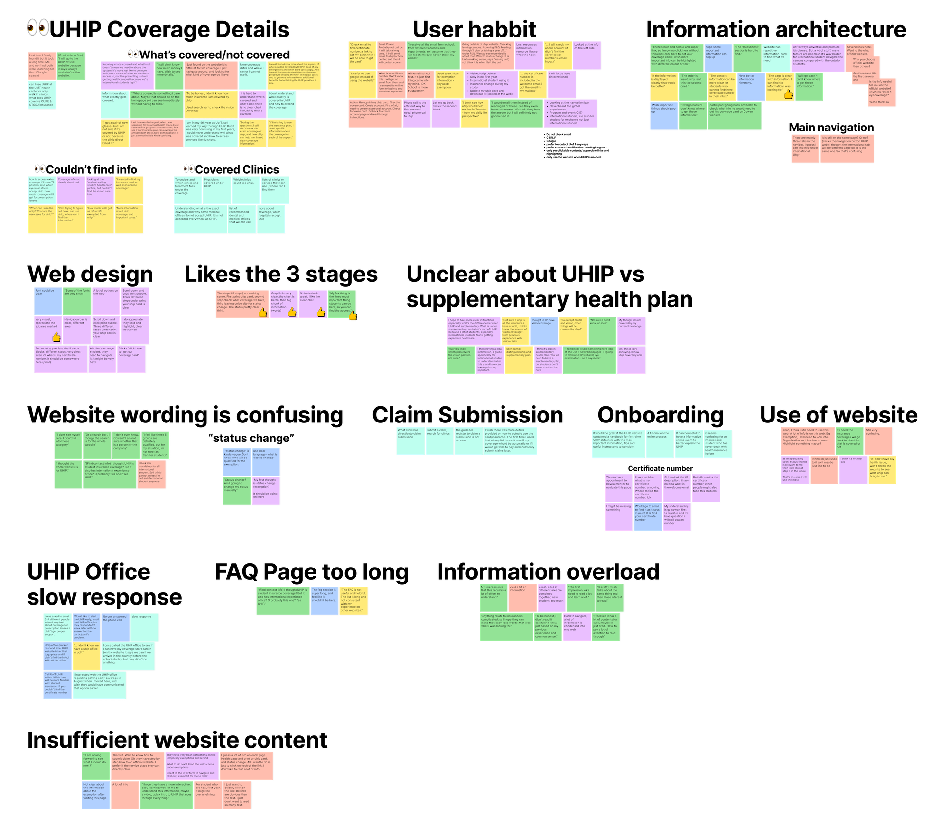


I conducted usability tests with 5 participants. During these tests, participants were asked to perform specific tasks related to the UofT UHIP website, such as finding information about UHIP certification numbers and card printing, as well as information about UHIP exemptions and extensions. These tasks were designed to help identify any usability issues or barriers that users may face when navigating the website.


After the brainstorm, I came up with some potential solutions to solve the pain points. The prioritization grid is generated to place all the ideations and divided them into three categories according to their impact on users as well as the feasibility when being implemented.
The home runs are
1) prioritized and upgraded coverage info about UHIP 2) a standardized content layout to improve the information findability


1. Structure
Increase user familiarity with standardized content layout and information hierarchy through out the webpages.

2. Visualization
The content and information is visualized for easier access and readability instead of long paragraphs of instructions.

3. Interactive Design
The collapsible hides text and only reveals details when it is expanded.

The important dates are put in a timeline and clickable to read related reminders. It makes the content more accessible and digestible.

The coverage table highlights only relevant info.

Based on our post-design usability test, 58% task completion rate given the same amount of task time within 4mins per task and 4 out of 5 participants mention the content on the website is organized and clean where only 1 participant mentioned this prior to the redesign. It is expected user satisfaction will increase by 60%.
One of the most challenging moments for our project thus far was how to communicate and negotiate with the client. Knowing the fact that the client is interested in a specific outcome even before our team looking into the research and ideating. After learning the professional standard from industry level, we can understand one step forward on how UX designers communicate with clients on a business setting, and some conversation techniques. Hence, after negotiating three times with our client, we conclude to follow her solution for the project, but will not limit ourselves in the research phase. Lesson learned from this will also be applicable to my future work as a designer, persuading client not to jump to the solution too quickly but give us enough time to explore and research at the early discovery stage. Scoping out at the beginning will help to understand the user, the context, and defining problems.


